Only 55% of S&P 500 stocks are in strong uptrends.
Here’s the chart:
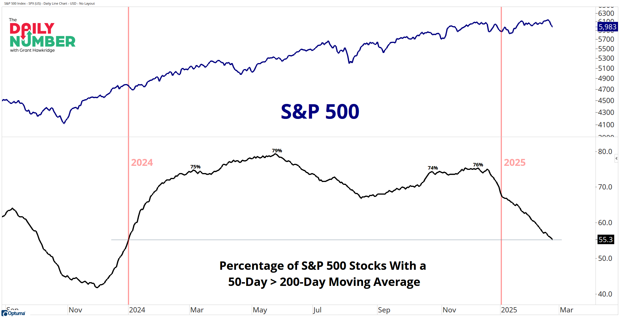
Let's break down what the chart shows:
The blue line in the top panel shows the price of the S&P 500 index.
The black line in the bottom panel represents the percentage of S&P 500 stocks with a 50-day moving average greater than its 200-day moving average.
The Takeaway: In a healthy bull market, the 50-day and 200-day averages typically move in the same direction, with the 50-day average positioned above the 200-day average.
Looking beneath the surface, only 55% of S&P 500 stocks show strong upward trends. The trend of this breadth indicator has been declining throughout this year and has now fallen back to levels seen at the beginning of 2024. This suggests that there is an underlying weakness in the market, which could pose further downside price action at an index level if the bulls do not address this issue.
Small cracks can also be seen at the index level. Although the S&P 500's 50-day average has remained above its 200-day average for the past 515 trading days, the 50-day average has recently begun to slope downward. This is the first time since September 2024 that the 50-day average has pointed lower.
Grant Hawkridge | Chief Aussie Operator, All Star Charts
ICYMI: New York was a killer event — but we’re making the next one even bigger. In May, we’re heading to New Orleans for the next Portfolio Accelerator, and members don’t just get a seat in the room — they get year-round access to our research, analyst meetings, and private Slack channel to join the conversation. Apply now to lock in your spot.
If you find my content valuable, I would greatly appreciate it if you could share it with your friends, family, and colleagues. Your help in spreading the word is invaluable in supporting our work. Thank you to all of you who share!