Global breadth continues to expand, particularly within Developed Markets, as 81% of the 22 developed markets I track are now above their 200-day moving average.
Here’s the chart:
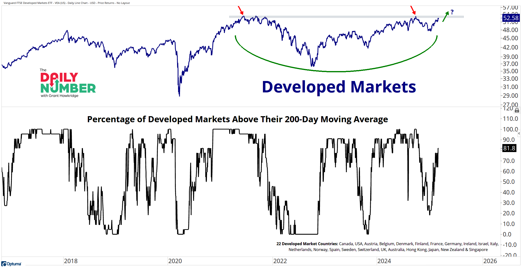
Let's break down what the chart shows:
The blue line in the top panel shows the price of the developed markets index.
The black line in the lower panel shows the percentage of developed markets above their 200-day moving average.
The Takeaway: At present, 81% of developed markets are trading above their 200-day moving average, the highest level we have seen this year. This is particularly significant given the ongoing selling pressure in the S&P 500, which has just recorded its third consecutive week of declines.
US investors have benefited from their tendency to favor domestic markets over the past decade. However, this trend could be on the verge of changing, with the relative strength of US markets diminishing while Europe and other developed markets are beginning to take the lead. This might be the moment when international markets finally emerge from their slumber.
With global breadth as a tailwind, the developed markets index (shown above) is showing signs that it might be ready to emerge higher after a multi-year consolidation period as it approaches its key previous cycle highs from 2021.
Is the rotation from the US to global markets in progress, or will this just be another failed attempt?
Grant Hawkridge | Chief Aussie Operator, All Star Charts
ICYMI: Retail earnings are rolling in, and a clear trend is emerging. What does it mean for the market? Jeff Macke breaks it all down — Read his latest take here.
If you find my content valuable, I would greatly appreciate it if you could share it with your friends, family, and colleagues. Your help in spreading the word is invaluable in supporting our work. Thank you to all of you who share!