Global breadth is expanding in 2025... NOT narrowing… Over 27% of world markets have made 52-week highs in the past two weeks.
Here’s the chart:
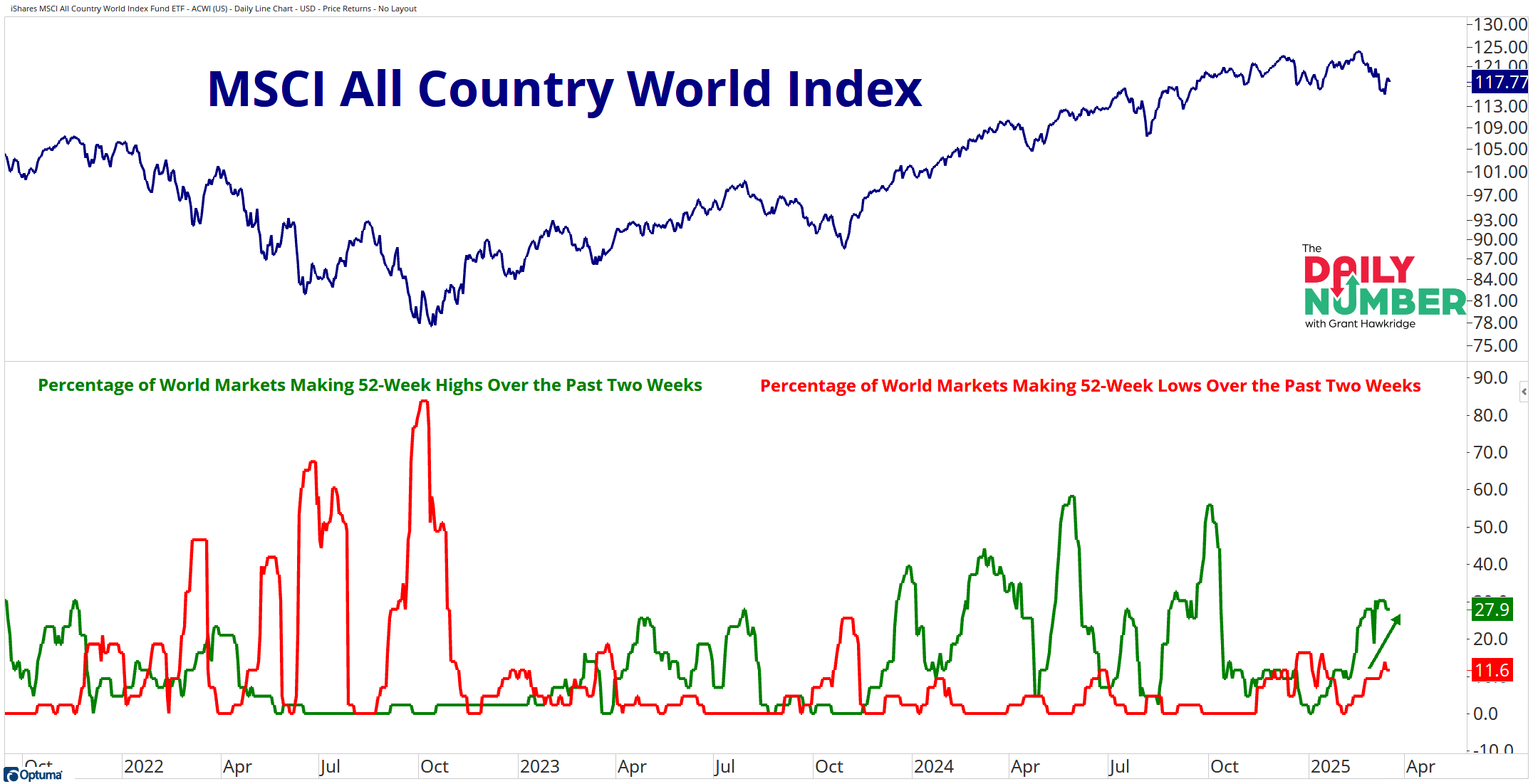
Let's break down what the chart shows:
The blue line in the top panel is the MSCI All Country World index price.
The green line in the bottom panel represents the percentage of world markets making 52-week highs over the past two weeks.
The red line in the bottom panel represents the percentage of world markets making 52-week lows over the past two weeks.
The Takeaway: If you want to know where leadership in the markets has shifted too since weakness emerged in the US, look no further than the rest of the world.
Throughout most of 2024, we observed that the percentage of world markets reaching 52-week highs over the past two weeks exceeded markets hitting 52-week lows for most of the year, and this same trend looks to be continuing into 2025.
Do you think this global leadership persists? Or will US large-cap growth names take back the leadership?
Grant Hawkridge | Chief Aussie Operator, All Star Charts
ICYMI: JC and Steve be doing an Emergency State Of The Markets stream TODAY 2.30pm ET to coincide the Fed's rate announcement and post-game press conference. They'll break down gold, commodities, bonds, and crypto to help you stay ahead of the curve. You don't want to miss this.
If you find my content valuable, I would greatly appreciate it if you could share it with your friends, family, and colleagues. Your help in spreading the word is invaluable in supporting our work. Thank you to all of you who share!