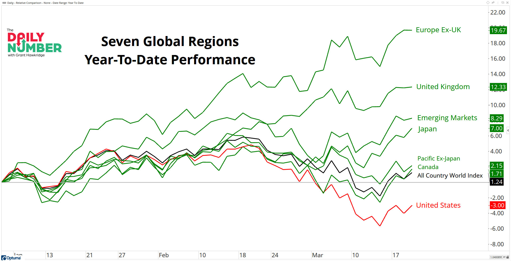
Out of the seven global regions I track, only one is negative year-to-date, and that is the United States.
Here’s the chart:
Let's break down what the chart shows:
Each line represents a different global region's year-to-date performance.
Green lines represent global regions that have a positive year-to-date performance.
Red lines represent global regions that have a negative year-to-date performance.
The black line shows the year-to-date performance of the All Country World Index.
The Takeaway: The global leadership has shifted in 2025.
In 2024, the United States was the leading region with an impressive return of 24%, while Europe Ex-UK was the worst region which lagged behind with only a 0.9% yearly return.
However, in the 52 trading days of 2025, Europe Ex-UK has emerged as the current leader, posting an impressive year-to-date return of 19% so far. In contrast, the United States is underperforming every region among the seven I track and is the only region to have a negative year-to-date return, sitting at -3%.
This is what we call global rotation, This trend has been around for a while, yet many people overlook the opportunities it presents due to their biases toward their home country or simply because they are unaware of it.
Do you think the trend of the United States underperforming will continue throughout 2025?
Grant Hawkridge | Chief Aussie Operator, All Star Charts
ICYMI: JC and Steve went live yesterday for an Emergency State Of The Markets stream. They went over gold, commodities, bonds, and crypto to help you stay ahead of the curve. Watch the replay HERE.
If you find my content valuable, I would greatly appreciate it if you could share it with your friends, family, and colleagues. Your help in spreading the word is invaluable in supporting our work. Thank you to all of you who share!