It is always good to play a little devil’s advocate.
One of the things JC has got me accustomed to doing over the years is thinking like a bear… even when I’m not bearish.
“Make your best bear case,” he’d say.
“What are the worst charts right now?”
It’s something we do just as a thought exercise. Even in the best of bull markets, this is a valuable technique.
Anyway, I thought of it today because I’m finding it uncomfortably easy to paint a negative outlook on stocks lately.
And I’m not alone. Market sentiment is in the dumps as the bearish evidence keeps piling in.
So, I went to the analyst team and asked them for their most bearish charts this morning.
Let’s look at some and talk about what they mean.
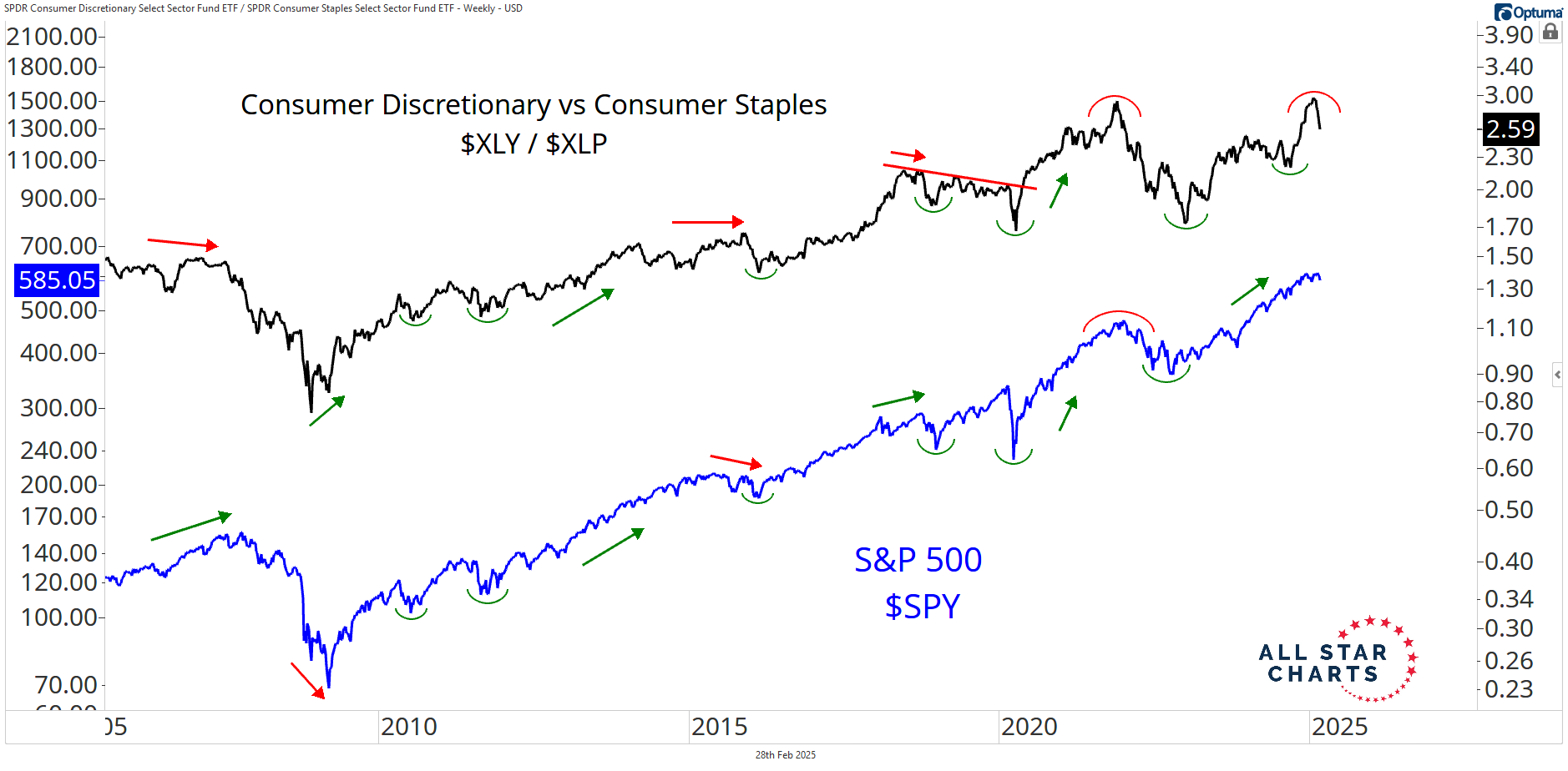
First up, this one is from the Fons:
He talked about this failed break in the discretionary vs staples ratio in his note the other day.
This relationship is as good as it gets when it comes to measuring risk appetite. Just look at how closely it correlates with the S&P over time.
The early February breakout failed and turned into a fast move lower. Now, we’re looking to see if the ratio can dig in and rebound or if defensive stocks will continue to lead.
If this bull market is to remain in good health, we need to see XLY/XLP reclaim those prior-cycle highs.
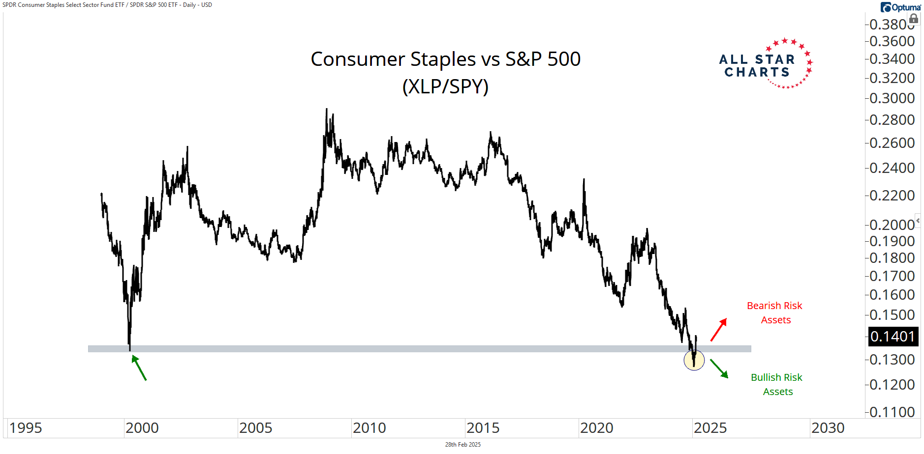
Here’s another one from Alfonso on the same topic, just shown a bit differently:
Staples are digging in at their all-time lows relative to the overall market. While a few weeks of defensive leadership is never a big deal, it would spell trouble if this turned into a sustained trend reversal.
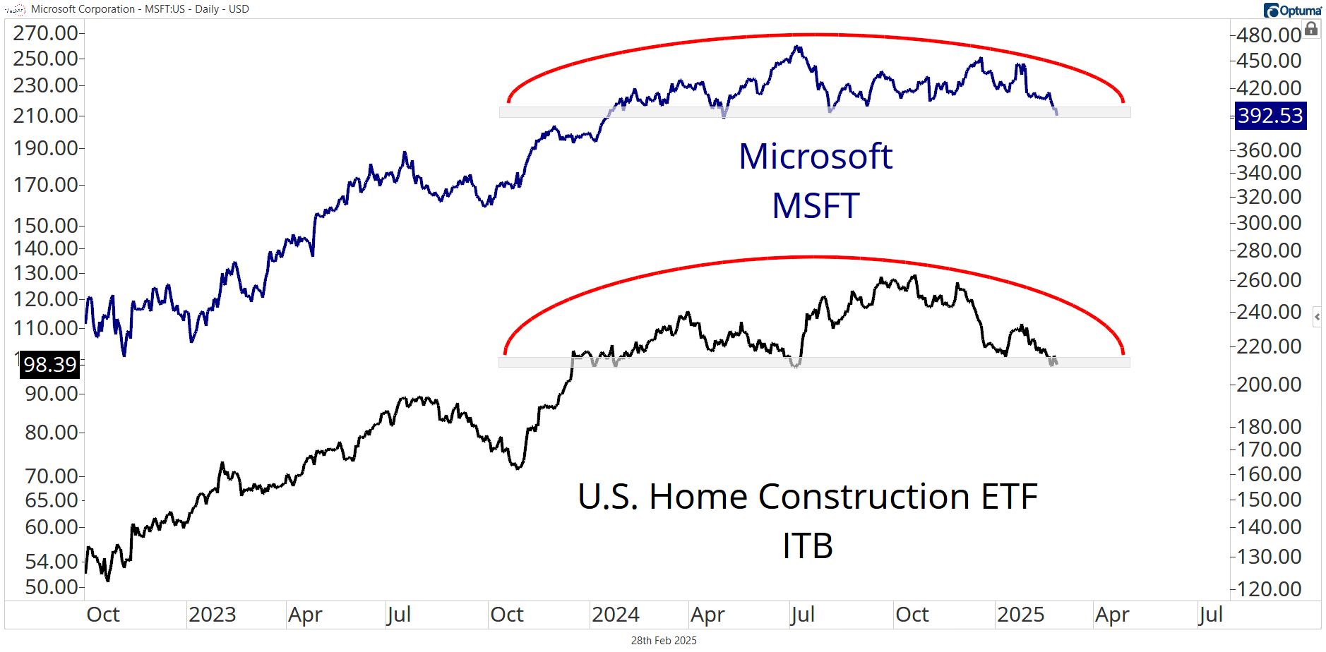
Next up, this one is from Sam. He is the lead analyst on Beat Report, so has a great pulse on US equities. He thinks it will be a big deal if these tops complete:
And I agree. These are “end-of-bull-market tops,” as far as I’m concerned. And they’re right there.
One big down day can complete these textbook reversal formations in homebuilders and Microsoft. They both represent some critical risk-on corners of the market that we could be losing.
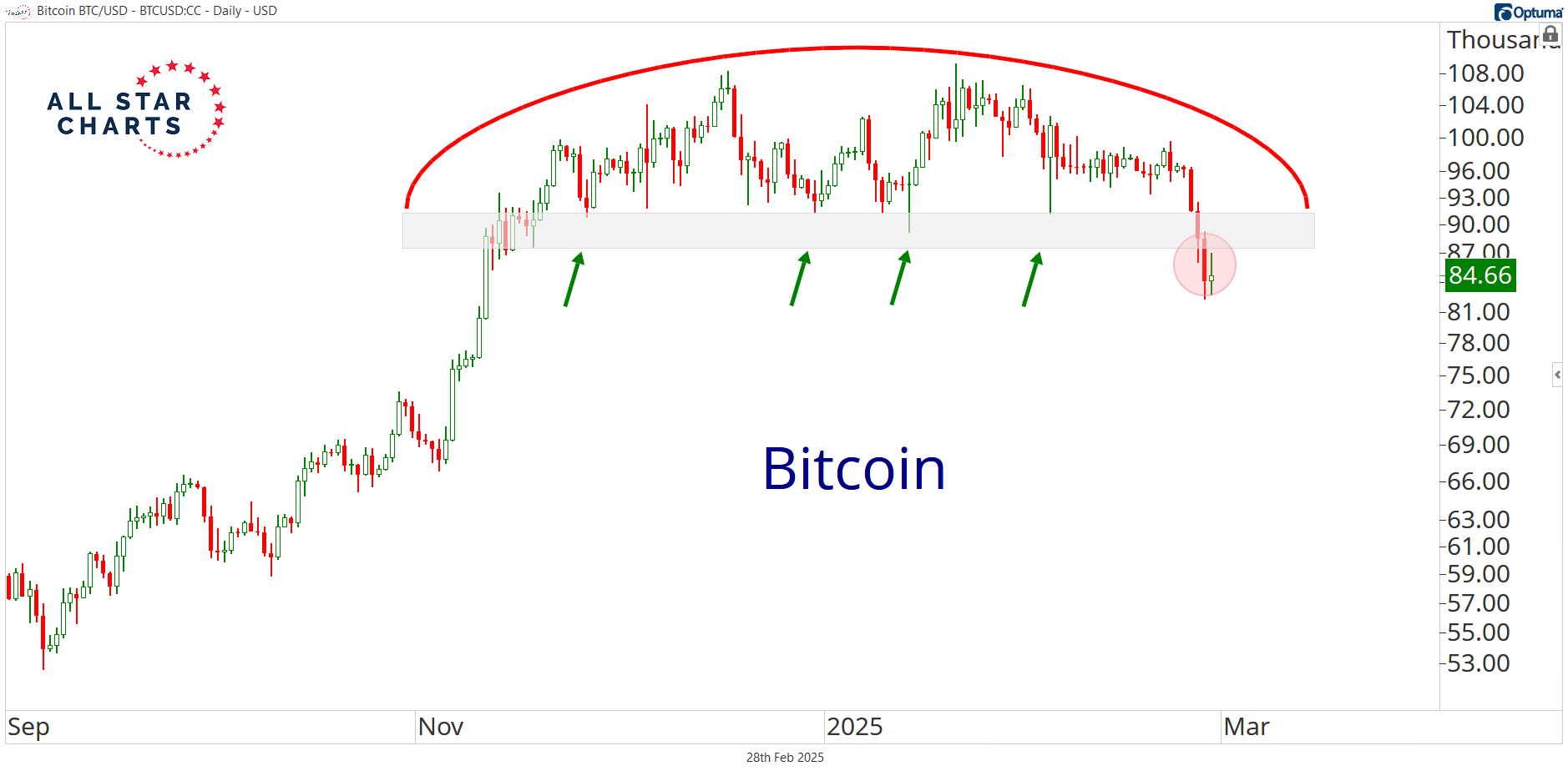
Last but not least, here’s one from Jason. As head of futures, he runs our precious metals research, among other things.
Bitcoin completed a textbook top this week and collapsed. It finally looks a lot more like everything else in crypto.
I shared some bearish thoughts on the space earlier this week. I’m basically out for now.
And I think Bitcoin is that important when it comes to assessing the risk of the overall stock market. It’s always been a significant risk appetite indicator, and I don’t see that changing now.
The takeaway from all this is that the bearish data points continue to stack up as selling pressure grips the market.
These are just a few that we’re monitoring.
I thought it would fun to let you all in on our little exercise.
I’m looking forward to discussing all this bearish evidence at our analyst meeting next week. It should make for a spirited debate.